Proposal
Overview
Aware of the booming willingness of purchasing properties in the city of Engagement, Ohio, previously the sleepy bedroom community, the government of Engagement is conducting a participatory urban planning exercise. The research would help the government understand the current state of the city, so as to reach a more accurate view of Engagement’s future potential.
The research collects the life trace of 1000 representatives via the urban planning app, which keeps detailed track of their daily activities, travels, and expenditure. Through the analysis of the participant attributes and their daily routines, the city is enabled to determine the allocation of vast renewal grant for major neighbourhood revitalization. This study aims to reveal the insights from the collected data.
Problem statement
In this study, we will work on Challenge 3 - Economic from VAST Challenge 2022. This challenge considers the financial health of the city. Over time, are businesses growing or shrinking? How are people changing jobs? Are standards of living improving or declining over time?
Considering the financial status of Engagement’s businesses and residents, we will use visual analytic techniques to address below questions.
1. Over the period covered by the dataset, which businesses appear to be more prosperous? Which appear to be struggling? To answer this question, we will evaluate a business’s performance by its number of participants’ visit and revenues earning. We will use the data of ‘Check-In Journal’ and ‘Financial Journal’ to complete the analysis.
2. How does the financial health of the residents change over the period covered by the dataset? How do wages compare to the overall cost of living in Engagement? Are there groups that appear to exhibit similar patterns? The dataset of ‘Financial Journal’ will be used in this question to understand the income of the participants, as well as their expenditure in food, recreation, and shelter. We will also partition the participant into different groups based on their education, interest group, age, etc. By comparing the income and expenditure of the participants within the group and with other groups, we will find out if there is any similar patterns.
3. Describe the health of the various employers within the city limits. What employment patterns do you observe? In this section, we will mainly use dataset of ‘Jobs’ and ‘Employers’ to analyse the turnover. By deriving which employers have the highest turnover rate, we can explore what similar patterns do this kind of employers have, and vice versa. For the perspective of employees, we will consider their age, education, and household to find out if there is any influence on their employment status.
Methodology
Dataset Used: As challenge three covers 3 different topics, below detailed datasets will be used respectively. Financial Health: FinancialJournal.csv, Participants.csv Business Performance: CheckinJournal.csv, Restaurants.csv, Pubs.csv, FinancialJournal.csv Employment Health: CheckinJournal.csv, Participants.csv, Jobs.csv, Employers.csv
Data Preparation: This session is used to understand the nature of data and proceed data cleaning. We need to understand the characteristics, format, and quality of data. Data cleaning will be done using Excel and R. Excel is used as the first preliminary data cleaning to remove columns that will not be used and simply combination with binary columns into a single column. Then for filter and chop with specific conditions and further analysis indicator calculation, we will use R.
Shiny Application: The page of the visualization would be our Exploratory Data Analysis (EDA). In our EDA, we will explore from 3 different options splitting by 3 tabs in Shiny. We will have visualizations for business performance using line chart, including education business , apartment leasing. Then use line charts, cycle chart to display financial health. The tmap will have us to expose turnover information based on city map. Then to plot stacked chart, violine chart with participant, employer datasets to display employment health.
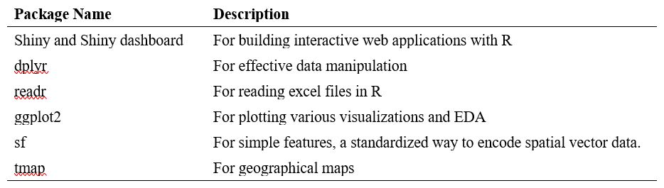
R package to be used:
Solution
Business performance
The dataset provided by VAST Challenge 2022 presents business in food territory. According to our observation, we classified the business into two types, which are restaurants and pubs. In our application, they will be evaluated based on the number of participants’ visits and business revenue. We will also use cycle plot and time-series line graph to illustrate the different number of visits and revenue of a restaurant or pub during the whole given period. To have an overall view of the business performance, user can compare the revenue and number of visits among the businesses, by simply filtering the category and period of time. Once the users want to have more detail of a specific pub or restaurant ID, they can input the ID on this page to find out the performance movement in revenue and number of visit.
Financial Health
According to Investopedia, the measurement financial health includes the amount of savings as well as the spending on fixed or non-discretionary expenses.
Wages Vs. Overall cost of living In order to conduct a horizontal comparison of participants with different attributes, an interactive scatterplot would be used to show the average salary & living cost. Each participant would be represented as a point in the plot. In order to show the trend overtime, an animated bubble plot would be adopted to display the distribution of wages as well as living expenditure. Multiple colours would be used to differentiate the participants by different groups so as to show comparison.
Monthly average balance Build up a table taking summing up the transaction amounts grouped by participantID and month. Use linechart to represent the change over time. Facet wraps are adopted for comparison across different groups such as education level and age.
Expenditure structure Group the financial journal into major categories and compare the total expenditure with monthly income. An interactive cycle plot with lines in all four spending categories would be to reveal the proportion and comparison.
Employment health
In order to visualize the employment patterns effectively, a multi-pronged approach will be considered. As the employment patterns and employer health both are correlative of turnover, so we prefer to start from turnover calculation at first. Then conduct using tmap package, sf package to visualize employer distribution by turnover rate on city map, highlight higher rate with light color. At last, looking into different attributes of employee age by using boxplot and violin plot, by education level using stacked plot, by salary base using density ridges to identify employer health and employment patterns.
Distribution of employer by turnover rate As per research, turnover rate is defined as the percentage of employees who left a company over a certain period of time. It’s often described in relation to employee retention rate. So, we will apply total turnover times of particular period / Total employee number this company ever employed of this particular time as turnover rate.
Employment pattern exploration Analyse employee structure from age, education, salary perspectives to identify employment patterns. For age portion, use violin and box plot to recognize distribution. For education level, we will conduct staked bar chart with percent information. For salary portion, we will apply to line charts to display whether there’s fluctuation among education levels.
Scripts can be viewed here